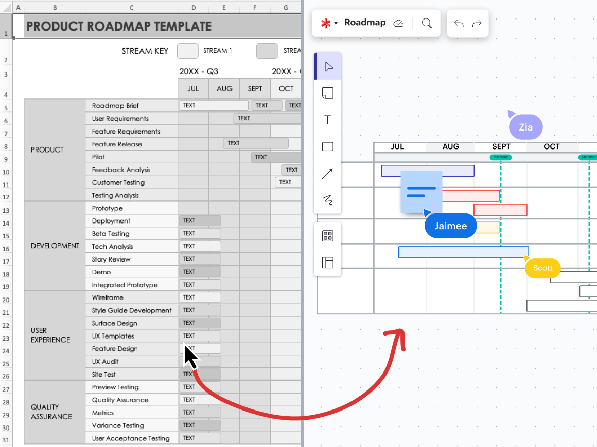
Collaboration reinvention: Spreadsheet struggles
Reading time: about 10 min
The term “collaboration” is so overused that many probably say it without even really understanding what it is.
But that doesn’t make it any less important of a principle to modern teams—it just means a little work is required to sift through the proverbial weeds and determine which actions will actually make an impact for your team versus performative tasks that aren’t actually effective.
Many tools claim to help with collaboration, so it’s easy to adopt a solution without knowing if it’s the best one for you or your team. Others keep using what they’ve always used simply because they’ve always used it. Or, maybe you use whatever tool is readily available, never questioning if there is a better way to accomplish your task.
We’re challenging this norm in our series that will help you rethink your tools and find better solutions to harness your team’s collaborative synergy. If you’re just joining us, make sure to check out our last article, which broke down the pitfalls of PowerPoint presentations.
Today’s topic: Spreadsheets
Spreadsheets have been around for several decades and originally were created as an alternative to bookkeeping by hand. They’re still great to input and analyze large amounts of data, but they have grown to fit other uses cases, too. And it’s not always working.
The problem is that almost everyone has spreadsheets at their disposal, so it’s all many people think or know to use. And as Nathan Rawlins, CMO at Lucid said, “If all you have at your disposal is a spreadsheet, then you’re going to need a long, boring meeting for every interaction."
Why spreadsheets just aren’t cutting it
Like we already mentioned, spreadsheets have their place: They’re good for the individual use case of working with data. Many also try to use them in presentations as a complex visual aid projected onto the boardroom wall or as a means to collaborate as a team, with several team members inefficiently working their way through a single document.
The truth? Just because spreadsheets are a tool everyone is familiar with doesn’t mean they’re the best one for the job. Here’s why:
-
They’re difficult to use
It’s common knowledge that spreadsheets are notoriously tough to work with.
It’s difficult to complete even simple tasks without training. Some resources suggest a minimum of 20 to 24 hours to learn Microsoft Excel (and up to three months for intermediate to advanced mastery). There are literally hundreds of workshops and college courses to introduce you to spreadsheet principles and functions, and unless you gain a high level of proficiency, you won’t be able to optimize the functionality of any spreadsheet software.
Once (if) you make it through all that, you have to dedicate even more time to creating the spreadsheet itself. And with 500+ formulas and thousands of rows and columns (and just as many opportunities to make a mistake), it takes a decent amount of both finesse and patience to create a spreadsheet that anyone would deem useful.
In an age where time savings is everything, do you really have the availability to take a college-level course before you can use an antiquated piece of software? And it will take even more time to manipulate the tool for a use case beyond its intended purpose.
-
They’re overwhelming to look at
Spreadsheets are great for recording data, but they’re not great for understanding the data and helping teams make decisions based on it. Being left to decipher a complex spreadsheet is frustrating and difficult. Without context, it’s nearly impossible.
And let’s say it like it is: Spreadsheets are boring. Sure, you can change line and text colors, but it’s not enough to make any spreadsheet actually interesting. This presents a challenge for anyone in a fast-paced world, but especially for visual learners who can’t do their best work with numbers alone.
-
They’re siloed
What happens in a spreadsheet stays in a spreadsheet.
Besides linking to other documents, spreadsheets just don’t play well with other tools. Unless you want to physically print your spreadsheet or attach it as a document in an email, there really isn’t a great way to move all your data and formulas to another program, so they often stay there for good. This means that they’re also difficult to keep up to date, especially when a spreadsheet is packed with complex data. It all amounts to a lot of manual time spent typing in numbers and repeating work.
Plus, spreadsheets are terrible to use in meetings. Because all you can do is screenshare and have one person make the updates, there’s not a great way to gather input and ideas in-app.
-
They’re awkward for teams to use
Spreadsheets aren’t only siloed from other tools; they also silo you from team members. They work fine enough for individuals, but any team who has tried to collaborate on one knows how complicated and inefficient it is.
There is a long list of features important to effective collaboration that most spreadsheets don’t offer. Many don’t allow multiple collaborators to join the document at once, and even the ones that do have poor tracking features. This makes it tricky to see what everyone else is doing and maintain boundaries so that your work doesn’t negatively affect others’ work. It becomes easy to accidentally override someone else’s important work, and most programs don’t offer revision tracking to restore lost data.

In short? Spreadsheets are highly error-prone. And you should think twice about trusting them with your most important work.
For example, did you hear about the trader known as The London Whale who lost $6.2 billion for JPMorgan & Chase Co. in 2012? The company reported that one of the major causes of the debacle was a flawed Excel spreadsheet that had been manually completed by copying and pasting data.
Or, consider the 2007-2009 U.S. economic period that has since been labeled by some as “the Excel Depression,” as one of its causes was a team of economists who made inaccurate conclusions from a spreadsheet coding error.
Additionally, spreadsheets aren’t optimized for internal communication, so you have to rely on another tool (Slack, email, etc.) to ask questions or communicate needed changes. There is no way to set up dependencies or alerts.
Why Lucid does the job better
If you’ve been using spreadsheets for years, you likely haven’t considered an alternative. But Lucid’s dynamic capabilities and tools make it a much better choice for team collaboration and data presentation. It checks all the boxes that spreadsheets fail to. Here’s why:

-
It’s innovative
Spreadsheets haven’t changed much since the ’70s. But unless you’re still wearing bell bottoms and polyester (and hey, we’re here for that), it’s probably time to find something more modern to trust with your most important data and work.
Lucid’s intelligent diagramming features help make sense of data in ways that spreadsheets just can’t, accelerating decision-making and driving innovation. Easily create process maps and user flows, scale cloud infrastructure, plan and organize scrum teams, and map data flows using a common visual language that boosts communication and helps you break down complex ideas, fast.
Lucid is continually expanding to include more features and offerings that maximize your productivity. For example, we recently announced the release of Collaborative AI to make quick work ideating, planning, designing, and building. And there’s always more coming. Work confidently, knowing you’ve got the most innovative solutions available at your fingertips.
-
It’s collaborative
Its collaborative features are where Lucid truly shines. The true antithesis to a static, rigid spreadsheet, Lucid provides a flexible workspace that makes it easy to share ideas, ask questions, and collaborate in real time, just like if you were in the boardroom (except better, because you can wear pajamas if you want).
Use sticky notes, freehand drawings, color-coded cursors, and a variety of shapes and lines on an infinite canvas for unlimited ideation and creation. Use emojis and voting activities to get people’s reactions and opinions in real time, built-in timers to timebox discussions and stay on track, and Breakout Boards to facilitate smaller group work for seamless syncs and meetings. Group insights by themes and trends, vote on ideas, and craft workflows and project documentation. And that’s just the beginning.
Plus, thousands of templates and plenty of integrations with your favorite existing apps make getting started a breeze.
-
It’s intuitive
You don’t have to spend hours learning software and formulas, then manually inputting data—Lucid leverages the work that you’ve already done so you can spend your time on high-impact activities that are directly affecting your bottom line, like problem-solving or interpreting data to make decisions.
Data overlay, or adding data on top of your diagrams, and data replace features make it simple to merge, transfer, and update data between diagrams so you can see the performance of processes, systems, and more. Smart containers (not unlike pivot tables or filtering within a spreadsheet, but way easier to use) allow you to group data sets linked to your diagram by unique attributes instead of sifting through a spreadsheet to find the info you need.Dynamic shapes allow you to add values and formulas to calculate or display information like progress, percentages, and ratings.
You can also link your Lucid documents to existing data for real-time updates, so you are always working with the most up-to-date information, and your document is a reliable source of truth for your team.
-
It’s engaging
If you want your team member to feel engaged in a project, task, or presentation, you have to actively try to not be boring. With hundreds of colors, images, emojis, symbols, GIFs, and more at your disposal, Lucid is anything but boring.
We believe collaboration is best when it’s visual, and we have the numbers to prove it. According to our research, 30% of knowledge workers think that visuals are the key to increased alignment and quicker task completion. And 69% believe visuals are extremely or very important for collaboration.
A note to spreadsheet enthusiasts
If you’ve been using spreadsheets all your life, and especially if you’re one of those that have dedicated hours to its mastery, you may hesitate to consider something different. But you can leave spreadsheets to the job they were meant to do and still use a better purpose-built solution for tasks that require deeper collaboration.
You’ll still benefit from incorporating Lucid into your workflow. Easily add diagrams, flowcharts, whiteboards, and more directly alongside your data directly within a spreadsheet. Visually bring your data to life to provide more clarity and context.
Or, link spreadsheets in your Lucid documents as a thumbnail that you can easily reference, expand, and edit. You can even import rows in Google Sheets as Lucid Cards in Lucidspark, which you can then tag, gather, sort, organize, assign, and more

Learn more about how Lucid integrates with the tools you’re already using.
Go nowLucid: Far superior to spreadsheets
Spreadsheets work great for a very specific use case, but there is a good chance you’re using them in ways they just don’t work—and your productivity and efficiency is suffering in the process. To truly be competitive in the modern world, you must approach your tech stacks intentionally, ensuring you’re using the right solution for the job.
Consider Lucid as an alternative. Our many integrations, countless features, and thousands of templates provide you with endless opportunities to increase productivity and boost clarity, so you can truly do your best work, faster.

Lucid helps teams build the future—not just talk about it.
Find out howAbout Lucid
Lucid Software is a pioneer and leader in visual collaboration dedicated to helping teams build the future. With its products—Lucidchart, Lucidspark, and Lucidscale—teams are supported from ideation to execution and are empowered to align around a shared vision, clarify complexity, and collaborate visually, no matter where they are. Lucid is proud to serve top businesses around the world, including customers such as Google, GE, and NBC Universal, and 99% of the Fortune 500. Lucid partners with industry leaders, including Google, Atlassian, and Microsoft. Since its founding, Lucid has received numerous awards for its products, business, and workplace culture. For more information, visit lucid.co.
Related articles
Bring your bright ideas to life.
or continue with
By registering, you agree to our Terms of Service and you acknowledge that you have read and understand our Privacy Policy.